If you upvote the GP's coment, you can find it that way too. If you go to your account page (by clicking your username in the upper right on the page), there's be links that say "upvoted submissions / comments", which will provide the full list of what you've voted on previously.
I got a loading spinner, and then an empty map of CA, and then the data loaded in, in distinct stages. If loading had gotten stuck at the second stage and I didn’t know better, I would have thought that there happen to be no fires at the moment.
Normally, I’d just shrug and move on, but in this case the misunderstanding could put people in actual danger. Until the real-time data gets loaded, this should be in some sort of obviously nonfunctional state.
Here's one from the California Department of Forestry and Fire Prevention (CalFire) that, you know, actually shows the fires, without a significant delay. (At least, it showed right up for me, unlike the one linked to the headline here.)
The linked site has a lot more data than the CalFire site. CalFire just shows a single marker for each fire -- and not even for all the fires currently burning.
For a longer example of how the notebooks can display fire perimeters as they grow over time, here's a direct link to the Camp Fire that burned Paradise last year:
"The high severity and acreage fires commonly seen today are driven by more extreme weather and build-up of fuel from our ongoing fire suppression activities."
If you watch this video https://youtu.be/nb2m8KKuwxk , the bright light goes out, and then we immediately see a big arc and explosion to the left. It looks like an electric problem. It turned out that the light was above a geothermal power station, plugged to PG&E grid. Even PG&E itself admitted that they were the cause of the latest Kincade fire, too, besides the fires that burned Paradise and part of Santa Rosa.
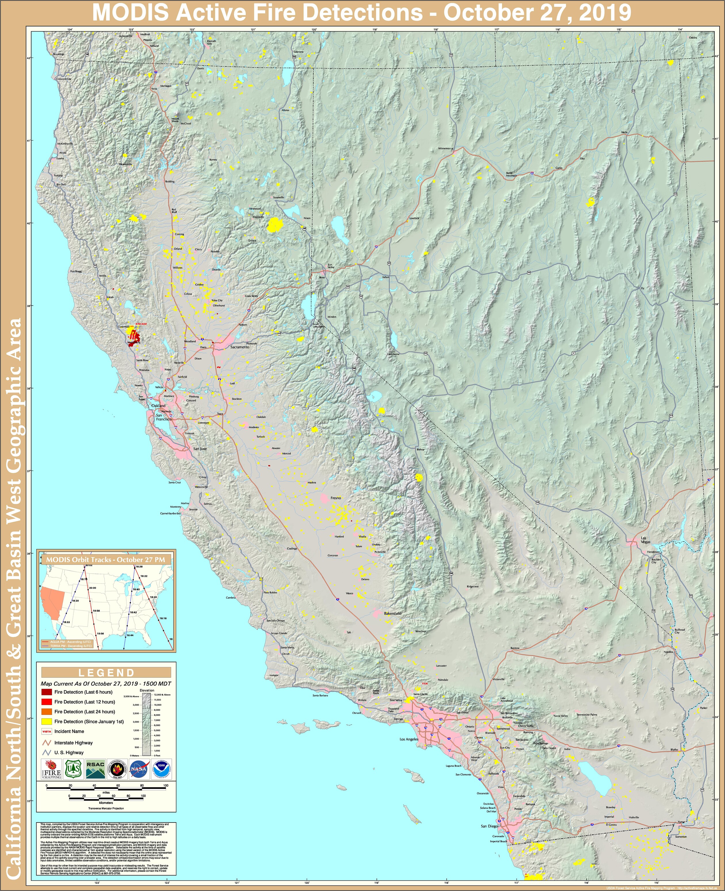
This is a better map of the Kincade Fire (Northern California wine country) that is updated multiple times a day using satellite imaging to determine hot spots. The red triangles are hot spots:
I've found the maps based on satellite data to be the most informative as they show you where the fire is actively burning and not just the permimeter. Here's a good one for California:
What if you released a live fire map app for the world, and hong kong protesters started using it to communicate to others where police are located (fire inside city = police).
While other hong kong people also used it to point out where actual fires are located.
Imagine the political shitstorm when Apple tries to ban that app!
n.b. as of 1600 hrs 27 Oct 2019, the fire should be visible as a large area between Geyserville and Middletown, with a much larger evacuation area from there West to the coast at Bodega Bay.
A good step would be to cut down and destroy every eucalyptus tree in CA and make it illegal to harbor the species. It is an invasive species from Australia and should not exist in North America. It has shredding bark which ignites, breaks loose, and flaming embers are carried long distances spreading the fire more quickly than native species.
[1] https://caltopo.blogspot.com/2011/12/launching-caltopocom.ht...