I've never understood the need for color profiles on images themselves. On monitors and displays, sure, those vary, but why allow people to specify a color profile on an image, thus making images no longer a ground truth for pixel value? It seems like the main use case is dealing with images that already have color profiles. What is the point?
The point is to use bits effectively and not waste them, by accounting for what usually happens on most displays and in our eyes & brains. If we don’t account for it, then (for example) a 1-bit difference between two bright colors means something very different from a 1-bit difference between two dark colors.
So what is “ground truth” exactly? We need to know what units we’re talking about; is it lumens, or “tristimulus” values (what we want our eyes to see), or LCD monitor voltages, or something else? First we have to agree on what ground truth means.
A big reason for common formats like PNG and JPEG to need color profiles is because 8 bits per channel is not enough color resolution unless you store the colors non-linearly. 8 bits is barely enough (or some would say almost enough) to represent low-dynamic-range images on TVs and monitors even when you have the colors gamma encoded or use a perceptual color space.
The problem with storing “ground truth” values for pixels in 8-bits-per-channel formats is that many experts would probably say this implies a linear color space. And a linear color space encoded in 8 bits leaves noticeable gaps between colors, such that you can see color banding if you try to render a smooth gradient. You lose up to 2 bits of color precision in some regions, notably the dark colors.
So, in order to not have color banding, we correct the colors before storing them by trying to make the colors have even steps between any 1-bit change in the spectrum. The color profile is just a record of what was done to correct the colors, so someone else can un-correct them as needed.
You might think we could do away with color profiles for high-dynamic-range images, but the non-linearity of our vision and our displays means that linear encodings are still inefficient with their bits even if you have 32 bits per channel.
Right, which begs the question why on earth would there be more than one image color profile. The image color profile should just be implied and the same everywhere.
> We're stuck with images stored in the display profile of old CRTs by default, because that was the most practical option at the time.
The analogue in photography is photographs lose color clarity and fade as they age. Why should I care if this is the case in images as display technology evolves when this is already a problem with every physical medium?
> For correct editing operations, and correct display. Sadly, it's not pedantry, it's reality.
I've been designing images and graphics for the web and sometimes for print off and on as a regular part of my various job functions since ~2009 and I have yet to see a situation where a color profile on an image isn't a huge pain and something that needs to be stripped away to get seemingly correct results.
Back to my point, I still don't see the value of having a color profile applied to an image. Images exist in the ether as platonic ideals, and we try to approximate them with our various display technologies. Why complicate the matter by also having multiple "flavors" of the platonic ideal itself? When I say (255, 0, 0), I expect the display to show me its best approximation of red. When I say (255, 255, 255), I expect the display to show me something as close to white as possible (and at the brightest possible setting). When I say (0, 0, 0), I expect the display to show me something that looks as close to black as possible. It's up to the display technology to decide whether this means just turn off that pixel on the screen or disengage the backlight or do whatever, but at the end of the day it's just trying to approximate black.
This is complicated enough, why do I need an image that will look good on only one kind of display and will have it's greens look pink on other displays. Isn't having a color profile for the display enough?
> When I say (255, 0, 0), I expect the display to show me its best approximation of red.
Which red? There isn't a single, true "red". And different materials produce different reds (my work's Sony BVM-X300's reddest red is going to look way different than your monitor's red). Not all displays use only RGB color primaries, too. For example, at Dolby's office in San Francisco they have a projector in their theater that uses 5 (IIRC) color primaries, not 3. 6-primary projectors exist. And other non-RGB displays.
> When I say (255, 255, 255), I expect the display to show me something as close to white as possible
Which white? D50? D55? D60? D65? D67? Something else? And yes, these different white points (and many others) are actually used in practice.
> (and at the brightest possible setting).
100 nits looks way, way different than 4,000 nits. Some monitors can do 10,000 nits.
> When I say (0, 0, 0), I expect the display to show me something that looks as close to black as possible. It's up to the display technology to decide whether this means just turn off that pixel on the screen or disengage the backlight or do whatever, but at the end of the day it's just trying to approximate black.
Which black? This might sound dumb, because we can agree that there is an objective "absolute black" (i.e. zero photons). But when an artist creates an image, the monitor they use has some version of black. If you don't account for that, the image may be distorted. Blacks can be crushed, for example.
An absolute color space exists. It's called XYZ. We could use it. Some image formats support it.
And the red in my left eye isn't the same as the red in my right eye. Yes, when the lighting conditions are just right, I see different hues out of each eye [1]. I have to wonder how one would (or should?) correct for that in an image file format.
I think the best we can do with file-level metadata is account for only objective metrics. Subjective differences are best handled outside of the file metadata. The user can tune their display settings to match their preferences. This allows for correcting for physiological differences and stylistic preferences. If all files had correct metadata (for objective metrics), it would be a lot easier for an end user to tune the system to their liking because their end results would be consistent with their preferences.
took me a while to notice that I perceive color and light intensity differently in my two eyes. I think this is actually pretty natural (IE, it happens commonly?). Either way, I can also see polarization (haidinger's brush) which confused me a bunch when I was trying to explain what I saw and everybody else thought I was crazy).
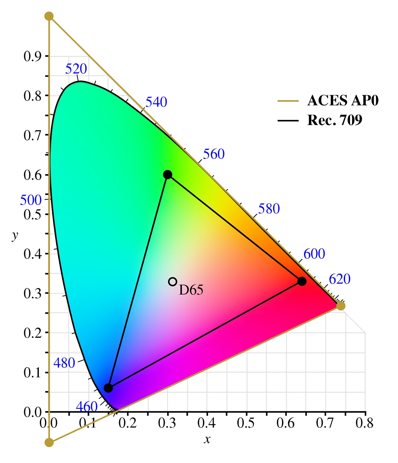
Okay, fair enough two out of three primaries are imaginary colors, but nobody said you have to use the whole color space when your processing pipeline is meant to be using 32 bit floats. Delivery formats might want to be using a more real color space.
ACES (AP0) is an archive format for when you want to be absolutely sure you’re not clipping any colours. As a working space it’s terrible and AP1 should be preferred, either as ACEScg or ACEScc
AP1 is almost the same as rec.2020? I'm not sure what you mean by 'working space' but if preserving all colors was a primary or even secondary goal I definitely wouldn't cut myself down that far.
You're assigning a color profile to the image in your model - the color profile of the display. Hence no color conversion needed, as source and target match.
What "red" and "green" are has changed quite dramatically with different display technologies. A display designed to meet Rec.2020 can show colors that other displays literally cannot produce and the deviation between the primaries is so big that everything looks like garbage if you don't do a color space conversion. Take some sRGB content and display it on a DCI P3 display. Looks like shit. Humans look like crabs.
> On monitors and displays, sure, those vary, but why allow people to specify a color profile on an image
The sole reason why we have device profiles defining device color spaces is so that we can convert from the image's color space to the device's color space. If images don't have a profile assigned to them, you don't need a device profile.
So you either have both image and device profile, or neither. Just one doesn't make sense.
But if you were forced to always use the same color profile on images? Why allow more than one? Wouldn't that vastly simplify the problem, as then you just have to worry about the device profile, instead of worrying about variation on both ends?
I get what you mean, but... the color profile of the image is the profile of the display where the image can be displayed without adjustment. Think of it as the display profile of the guy that sent you the image. The magic math transforms the image to your display profile. That means it will look exactly the same on both displays. If they both have a correct display profile.
If your green is going pink, then either your profiles are wrong, or your software is broken. Maybe it really is pink, and it just looks green for you, because you're ignoring color profiles.
But the fact is, most software is broken, and you should store images with the sRGB profile.
And also, you can actually calibrate consumer hardware, so that you can scan a photo, and reprint it. And the scan, display, and print will look exactly the same. (It's not the case by default, because consumer printers do what you do, stretch or fit the color space to the printer's. The Vivid and Natural profiles in the driver, respectively. This is a good default for documents, not for professional photography.)
Right, so sRGB should really just be the only allowed profile for images. That's my whole argument. There should be some standard profile all images should use, and then displays should deal with the work of converting things to a suitable display profile. Allowing more than one image-level profile just makes things way more complex for no perceivable benefit.
>That means it will look exactly the same on both displays. If they both have a correct display profile
We can continue believing that Santa exists, or we can accept that effectively nobody has correct color profiles, and doesn't care either.
It's nice metadata you have there, would be a shame if I applied night mode to it at 6PM.
> also, you can actually calibrate consumer hardware
...with professional hardware that costs more than the one you have at hand.
Again, pretty much everyone will just tweak their monitor/printer settings until they get results that look OK.
>display and print will look exactly the same
Until you turn off the lights. Or until you turn on the lights (what color temperature is you light?). Or until the wind blows, moving that cloud over the sun, changing light temperature.
Or — wait for it — actually, that's all, while you've been waiting the sun has set.
The point being, all we can shoot for is FF0000 being what would be "red" for most, 00FF00 being "green", and 0000FF being "blue" — and then accept the "fade" of the digital image from one screen to another as a fact of life.
So, learn how to stop worrying and love unspecified RGB colorpsaces. Magenta only exists in your brain anyway [1]
Side note: did you ever think about how your recorded music isn't adjusted for the frequency response of the loudspeakers, and half the people will listen to it with the "BASS MEGABOOST" feature on anyway?
That's why the art of mastering exists. It's accepting the reality, and putting work into making it work with uncalibrated, crappy hardware — as well as hi-fi gear.
PS: have fun calibrating your vision to make sure that you don't see green where I see red
As you mention, our brain adapts pretty easily to varying lighting conditions in the real world, and that could also work on a screen[1], but the ambiant context is what matters: if you look at an image “A” in your said “undefined color space” after having spent quite some times looking at sRGB images for a while, then your image “A” would look absolutely horrible until your brain starts to adapt, like when you put sunglasses on or off for instance. The big difference being: with sunglasses, we have no choice but wait for our brain to adapt, but on a computer all the user would do is close the image.
[1]: even though for some reason I don't know, it works much less well: if you try and take pictures with the wrong white balance setting, the picture will look like shit no matter how long you look at it.
Thankfully, "as bright as the sun" is waaaaaaay outside of what a monitor is capable of : SDR is (supposed to) top out at 10^2 cd/m^2, HDR10 at 10^3, Dolby Vision maxes out at 10^4 cd/m^2, but the midday sun is... ~10^9 !
sRGB is quite literally defined as "the average 90s CRT in an office environment", i.e. full-white sRGB on a HDR display should be around 100 nits or so in those reference conditions (i.e. display set to "reasonable" brightness).
Do you have a recent iPhone? Try taking a picture with the sun in it: the white of it will appear white as well, but the phone will display it considerably brighter than the white UI surrounding it.
> This is complicated enough, why do I need an image that will look good on only one kind of display and will have it's greens look pink on other displays.
That is precisely what attaching a profile to the image is supposed to avoid. It indicates what (255, 0, 0) in that image actually means. Then you convert that to the display profile to get the triplet that you must send to the display to actually get something that looks like it.
> Isn't having a color profile for the display enough?
> The analogue in photography is photographs lose color clarity and fade as they age. Why should I care if this is the case in images as display technology evolves when this is already a problem with every physical medium?
What does "255" mean? If you just take it to mean "max saturation that your display can output" then it's going to be perceived as a different color depending on the viewer's display. That is undesirable. And due to historical reasons (the capabilities of CRT monitors) the meaning of "max saturation" was de facto standardized to what we now call sRGB. If you want to encode a greater range of colors than sRGB then you need to be able to say that hey, this "255" is more saturated than what sRGB considers "255" and should not be displayed on sRGB without conversion.
Because display technology can't reproduce the full set of colors we see and and moreover, we have a finite number of bits to encode the value of any pixel. A color space/profile is both a target for display manufacturers to produce and a way of standardizing the trade off between bit depth and quantization error.
Unfortunately, that's not the case in pragmatic reality.
When I say #ff0000, do I mean "sRGB red", as a TV would display in pure red phosphors back in the 1970s, or do I mean "1000K" / 700nm red (daylight is 6500K), which can only be reproduced by specialized displays?
Most people from the time before Apple made Display P3 wide color displays standard in all their products — so, most HN commenters — believe that #ff0000 just means "only red, no green or blue" — but all web browsers currently are left to invent their own answer for what #ff0000 means, and they do not all invent the same answer. Yet.
So it is with images.
In the beginning times, people made sixteen-color images for NTSC monitors, and then other people learned you could display synthetic colors that don't exist by mangling the image bitstream to the monitor, and those sixteen colors were hard-coded but varied by like +/-5% per device due to acceptable manufacturing tolerances, so they were internally consistent anyways.
And so we end up, today, trying to solve color profiles for file formats that specify colors as RGB hex values — which are, by definition, restricted to sRGB and thus wildly insufficient. But if we plan too far, we get file formats that are totally ridiculous - TIFF comes to mind - that can represent anything under the sun, at the cost of having a 1:1 mapping of "pixels" to "bytes" or worse.
You may also find the history of the EXR format relevant here, as it supports a functionally infinite amount of dynamic range in images, and there are definitely good niche use cases for it — but pragmatically, it's ridiculously overkill for normal everyday purposes. You could argue that everyone should use EXR in Lab, but then someone would suggest Oklab (since it makes better perceptual compromises) or HSLuv (what a great name), or you could try storing raw CIE 1931 chromaticity coordinates, which has been deprecated by CIE 170-2 to address serious flaws in the 1931 system.
Tying this back to engineering, there are often very good reasons for designing a processor or a byte store to be RISC or CISC, big or little endian, and we simply cannot predict what will work most pragmatically for all cases universally ahead of time, any more than the metric system was invented early enough in time to prevent miles per hour from being a unit of measure.
A color space and color profile are not the same. The point is knowing what a byte represents in a byte array. Is it red, hu, saturation, alpha, brightness etc?
No single color space is complete. Each has trade-offs. I would actually say that color profiles help get closer to ground truth, that is, rendering intent.
Isn’t that kind of like saying Real numbers are complete? Yes, it’s true, but we don’t have an infinite level of precision for each colour. So we have to, practically speaking, limit how many colours can be specified to some reasonable (and arbitrary) number, e.g. 10 million or 1 billion or more (in terms of number of colours in a colour space) and representation in digital bits. Also, since I conflated the two a bit, it is often helpful to restrict what the max range of a colour is so that you can get more useful data out of the same precision. It’s kind of like creating a dictionary to compress data, you can express more useful values with less data by choosing to display a subset of colours and by picking where the white point is for your display. These optimizations used to mean more than they do today, perhaps, but it can still take a lot of effort to transfer 10-bit or 12-bit raw pixel data at 4K resolution, 120 times a second… And it’s worth pointing out that while 8-bit is all you might need as precision for perceptually lossless HDR (with dithering), that kind of range isn’t good enough for colour editing work. It’s like starting a photo edit from the JPEG rather than the RAW file.
8 bit just objectively isn't enough for hdr. 8 bits is few enough that you can pretty easily see banding on a simple color gradient in sdr. Dithering helps a lot, but once you get to HDR 10 bits is pretty much the minimum.
If you compare Rec.2020 with 10 bits per channel and sRGB at 9.5 bits per channel, both of them using the same peak brightness, you should see similar amounts of banding on both.
Increasing the maximum brightness can require a lot of extra bits to keep things smooth, but that's a separate thing from which colors are possible.
Ah, I see your point, but I still don't understand this argument, because in practice not only we want extra brightness in colours around the usual white points, but also we need the extra potential physical brightness to extend the colour space itself in terms of "colours only" (not sure that this even makes sense ?) because of the differing needs of different colours.
(I'd assume that this is especially relevant for backlit displays like the liquid crystal ones, since they have to use the same potential maximum source power for all of the channels.)
Gamut is affected by brightness but not that much.
Rec.709 has 10 and 12 bit modes too, and it needs them, even though it has the same gamut as sRGB.
The reason 10 bits isn't enough for Rec.2020 is because 10 bits was never enough to fully represent any gamut. Once you add enough bits to properly support a gamut, then extending it to match human vision is a tiny cost.
And to be extra clear, when I initially said "The difference between all visible colors and a more constrained color space", I was talking about taking a color space and expanding its gamut without changing anything else about it.
I guess when I said "no color space is complete" I meant "no color space is faithfully bijective to nominative human visual sensory response." Because such a thing is basically impossible (or insanely nonlinear and unwieldy).
Also these color systems all or almost all assume a "norminal" (to steal a word from Everyday Astronaut, normal+nominal) average human vision system. If your system isn't norminal, average, human, or even visual (visible light), then your color space is an incomplete map of the territory.
So for any given array of pixel channel, there is either an implicit assumption or explicit color space of what those values "mean".
So GP's question was basically "why do we need color profile?" and the short answer is "to know what images should look like".
In order to know what an image should look like, a "perfect" or "complete" representation, at minimum the real colors must be injective to the color space (every value has at most 1 color). You could argue that the color space needn't be injective (values that have no color), which is probably fine if your image is static and you never manipulate it. As soon as you manipulate values of your image in your color space, you run the risk of falling outside the color domain.
But really to unpack this whole thread, my essential point is that color spaces are about engineering tradeoffs. sRGB can't reproduce many colors. CIE 1931 represents all color but has imaginary colors.
Ergo, I contend there is no "complete" color space.
Yes, it has to be injective from the real world to the file format. It doesn't have to be bijective.
> As soon as you manipulate values of your image in your color space, you run the risk of falling outside the color domain.
If your manipulation could go outside the domain, then your manipulation is incorrect. Like, if I have a number from 0 to 99 that I store in a byte, it's fine that a byte is not bijective to those numbers, and if I end up with a byte representing 105, then I did something wrong that corrupted my byte.
If I'm doing incorrect math, a bijective color space doesn't fix the problem, it just guarantees that I get an incorrect color out the other end instead of possibly getting an incorrect color or possibly getting an error value.
Good luck representing that with only 3 channels, without using "bytes representing 105" (aka imaginary colors), and trying to stay percepetually uniform !
It gets even worse : the real color space is non-Euclidean : it stretches out, parallel lines drift further apart, etc.
> without using "bytes representing 105" (aka imaginary colors)
I think you misunderstood my point.
I'm saying it doesn't matter if certain byte sequences are invalid and don't correlate to real colors.
Imagine you're encoding two digit numbers into bytes. It's not bijective but that's fine, no correct two-digit math will give you an invalid byte.
Or imagine you're encoding numbers into bytes the way UTF-8 works. It's not bijective to all sequences of bytes but that's fine. No correct manipulation will give you a sequence that can't decode.
If you're trying to do incorrect math, you've already lost, and no color space will help. For example, overflowing your red channel in sRGB could turn your eggshell into a cyan.
> and trying to stay percepetually uniform
Where did that come from?
Zero encodings will be perceptually uniform, therefore being non-uniform isn't a disqualifier.
If you author an image on Display A and save its colours, then how does Display B know to render colours correctly that looks consistently with Display A?
You have two options:
1.) Tag Display A's colour space into the image, then convert colours to match Display B's colour space when rendering;
2.) Convert colour data from Display A colour space into a generic colour space (like sRGB, Display P3, ACEScg, etc) and embed that in to the image, then convert colours to match Display B's colour space when rendering.