Hacker Newsnew | past | comments | ask | show | jobs | submitlogin

I made a custom Iosevka build by selecting glyph variants based on Atkison Hyperlegible.

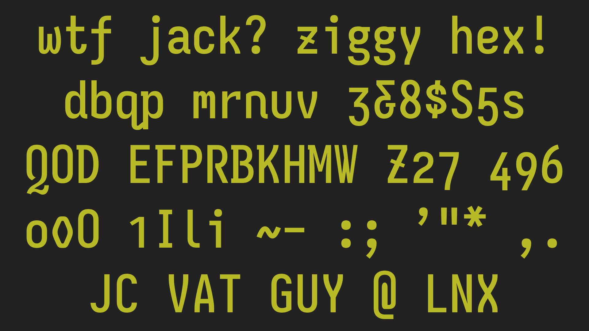
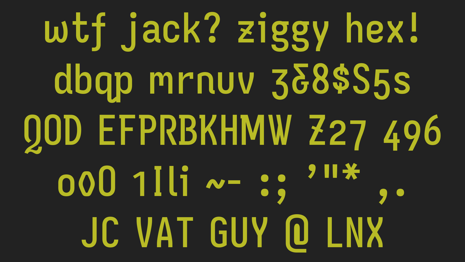
Iosevka: https://typeof.net/Iosevka

"Hypersevka" build plans: https://github.com/jdknezek/Iosevka/blob/jdk/scripts/hyperse...

Screenshots: https://imgur.com/7BZS3Pp https://imgur.com/sudNqWM


Iosevka is absolutely wonderful!

I have my own builds -- not based on AH's glyph choices, but also chosen to minimize glyph ambiguity.

I'll mention another great legible monospace project: 0xProto

---

Build: https://github.com/AndydeCleyre/archbuilder_iosevka/releases...

Screenshot Mono: https://cdn.imgchest.com/files/k46acrxl297.png

Screenshot Mono with syntax highlighting: https://cdn.imgchest.com/files/l4nec9d8lm4.png

Screenshot Proportional: https://cdn.imgchest.com/files/6yxkce8p6a7.png

0xProto: https://github.com/0xType/0xProto


I really like the aesthetics of Iosevka, but the glyphs are really narrow - resulting in severe readability problems for me (I'm diagnosed dyslexic).


You can configure your build to be wider than default. In order of increasing width:

- semi-extended

- extended

- extra-extended

- ultra-extended

I think by default the extended variant is included in most builds anyway, if you want to try it.

FWIW here's a sample of my usual build's extended variant: https://cdn.imgchest.com/files/b49zcjd53oy.png


I'll add that https://github.com/0xType/0xProto is worth checking out, if you haven't. What mono (and proportional) fonts do you find work best for you?


* MonoLisa was pretty good, minus the cursive. As a late/16yo diagnosis under a British curriculum, I cannot express in words just how hostile cursive is. Its continued use in society is an embarrassment /rant

* Intel Commit.

* I am currently using Maple Mono.


Guidelines | FAQ | Lists | API | Security | Legal | Apply to YC | Contact

Search: