This is a nice collection of graphical user interfaces. This reminds me of the well known Toasty Tech collection (http://toastytech.com/guis/), but with a narrative tying together the evolution of these GUIs.
Some feedback:
1. All interfaces presented were graphical user interfaces for desktop personal computers. However, there's a wide world of user interfaces for computers beyond conventional point-and-click GUIs. A command line interface, for example, is still a user interface, and in fact there has been much diversity of command line interfaces besides Unix and MS-DOS. For example, I remember reading in The Unix Haters Handbook critiques of the Unix shell, comparing it to the CLIs of other operating systems such as VMS. It would have been cool to have learned about the history of various CLIs and how they evolved. Regarding other user interfaces, there are touchscreens and voice, and even among GUIs there have been models that were not heavily influenced by the Apple Macintosh and Microsoft Windows, such as Symbolics Genera, Project Oberon, and Plan 9's 8 1/2 and rio GUIs.
2. Some highly influential GUIs are missing. For example, as influential Windows 95's UI was, its look and feel clearly shows influences from NeXTSTEP, the first GUI to introduce the gray, 3D, beveled look that Windows 95 embraced.
I was dumbfounded to find NeXTSTEP missing: it was among the very most influential GUIs in history. Much of 95's UI (and OS/2's UI) were stolen directly from it, and badly, right down to icons.
This page also seems to focus not on UIs, not on GUIs, but just on GUIs for personal computers. No discussion of the tablet->PDA->phone->small device UI evolution at all, even though that UI route has now had profound impact even on laptops. Where's the Newton?
You seem to be right: I just picked one, “Xerox Star”, and it is copied from Wikipedia with a couple of changes: “was” → “is”, “mouse” → “mouse (two-button)”
I think that putting attributions on each entry would be too distracting, I’d rather keep the clean style that focuses on the content, but there should be some attribution in the page footer.
MIT Project Athena was also hugely influential: X Windows wasn't the only thing to spin out, but MATLAB and other pre-cursors of today's Jupyter style notebooks. The VAX super-mini grid could be used at night as a renderfarm ;)
To be honest, I think Athena and X have had very little influence. X's GUI design (and the Athena widget set) was entirely derivative of the Lisa/Mac interface. The notion of a client-server GUI system -- a historic extension of Unix terminals and servers -- has largely failed and is now disuse on modern Unix systems. The idea of a customizable window server has not spread beyond X to any other major system to my knowledge. Its font subsystem, graphics subsystem, and event management was and remains astonishingly primitive. It's hard to think of anything X innovated that now appears in a modern GUI.
Despite what the random Wikipedia contributor implied, neither MATLAB nor Maple have any historical relationship with X Windows or Project Athena. It is a huge stretch to say that Athena invented the concept of per-course educational and research software given that Apple had been doing that nearly a decade before, and indeed had built its entire business model on the concept. And the precursor to Jupyter notebooks was Mathematica, full stop. Mathematica invented the very concept of the interactive notebook, and it did so on NeXTSTEP.
It also misses all the "text GUI" interfaces found on eg. MS-DOS and mainframes. These are super-efficient to navigate and use using just a keyboard, and extremely fast for data entry in comparison to modern systems.
Actually, the NeXTStep style was adopted by Windows 3.1 and that made it look subtly different from 3.0. Given the timing, I think the actual direct influence on Windows 3.1 was Motif, which in turn was inspired by NeXTStep.
When the NeXT was announced I thought it had been influenced by Randy Smith's (Xerox Parc) ARK (Alternate Reality Kit):
IIRC, Microsoft actually had an hand in Motif, which followed the IBM Common User Access spec. Some of this I suspect was for legal reasons with Apple suing everyone.
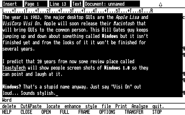
Thanks for the Toasty Tech link. It looks like some of the screenshots in the featured article are actually from Toasty Tech, e.g., this Visi On Word screenshot:
Both the GUIdebook Graphical User Interface Gallery and Nathan Lineback/Toasty Tech's GUI Gallery are significantly more comprehensive than the linked-to page.
Nice collection, indeed. Usually (and it seems to be the case here), UI studies/collections tend to emphasize operating systems and shells, but there's some very interesting UI paradigms brought on by applications. For example: music software like Fruit Loops and Native Instruments, skeuomorphism from audio plugins; or graphical software like the flow-based shader modeler in Blender, the quad menu in 3DSMax, the dark mode on Autodesk Flame/Flint/Inferno/Smoke; or the MS ribbon; or things like IntelliSense etc.
Speaking of communications, there's things like Strowger switches (https://m.youtube.com/watch?v=xZePwin92cI&t=111) which I think count because that's what people were interfacing whilst using the phone (this became crossbars and relays in the 1910s and 20s respectively)
Even if we want to limit to computers, we have batch versus time-sharing flow, teletype versus graphical terminals and along those lines you have the work of groups like Evans & Sutherland in the 1970s (such as the line drawing system 1 https://en.wikipedia.org/wiki/LDS-1_(Line_Drawing_System-1) ) or Scientific Data Systems which was later acquired by Xerox. You also have the world of analog computers, the most famous of which is the slide rule.
Then you have specialty machines such as the Fairlight CMI synthesizer with the lightpen interface (https://m.youtube.com/watch?v=iOlPCpSmhRM&t=40) which really laid the groundwork of most DAWs to this day. For music there's lots of things. The theremin which you all know about but also things like Nikolai Voinov's "Paper Sound" https://m.youtube.com/watch?v=Mmejo9WL2gY
Also mind the use of a mouse in another video animation software from around 1970, by Marceli Wein and Nestor Burtnyk, running on a SEL 840A in Canada, three years before a mouse was used at PARC:
Ah the TX-2! That takes us back to Sutherland and the famous key frame animator, always good
Check out the IBM 2250 John Whitney is using in this 1968 video
https://m.youtube.com/watch?v=jIv-EcX9tUs where he basically invents screensavers for an earlier foray into animation
Regarding books, I've always opted for a book named "Glass" on various display technologies and methodologies, along the lines of "Core Memory" by John Alderman and Mark Richards (who does this amazing CHP photography) [1]
wow fascinating. I haven't read either nor have I been to the computer museum in the bay (I know I know ... I should like, be on the board or something)
First-hand industry and machine documentation of the pre-micro era. I've been working on a narrative recently of what I call a time-sharing crash in the early 1970s.
I don't know if that's much to go on simply because finance worked differently in that era and was relatively crash free in the modern sense until Reagan's deregulations and 1987's black monday.
I'm not a professional economist and the computer industry was very insular at the time but looking historically there appears to be a cluster of thematic bankruptcies, mergers, acquisitions and industry departures (such as GE getting out of computers selling its division to honeywell in 1970) that I think you can coin the idea of a "time-sharing crash" somewhere in the early 1970s.
It has all the dynamics. A new adjacent industry came out right after it (microcomputers), a migration of industrial centers (this is when boston's route 128 really started taking a backseat to silicon valley) and there were firesale style selloffs in the mid-70s of timesharing systems in the backs of magazines like computerworld from aspiring smaller firms that came in on a hype but were too late.
There were industry darlings of 1968/69 that got washed up by the early 1970s. The 1960s 7 dwarves of Burroughs, UNIVAC, NCR, CDC, and Honeywell and RCA and GE gave way to the 5-player BUNCH as the last 2 left the industry in 1971. Everyone else basically left over the next 15 years as they Yahoo/Sun'd their warchest in long declines.
All signs are there for the following timeline
1970?-1973? timesharing crash
1981-1982 videogame crash*
1993?-1997? unix workstation crash
1999-2001 dotcom*
2008 - general market*
2022 - crypto*
The things with *s are settled - the unix crash is mostly settled as real, but the time-sharing crash is something I've pieced together and haven't found anyone else mentioning
I appreciate the encouragement. I'd need a general hypothesis to make it interesting and give it a narrative structure.
It's just a giant relay race where people are grabbing batons left and right and then taking it a few steps.
It's always "well I've got this thing and here is how it has to be used" and we're still in that world of limitation as I drag my thumb across a handheld piece of glass to send this.
The machine and interface are artefacts of each other; reality's constraints on our ideas. It'll have to be motivated by something more specific than that though. Otherwise it'll just be a 2,000 page encyclopedia
Yes, CLI is missing from the study but so are alternatives like Natural and Tangible and Zoomable. NUI/TUI/ZUI/3DUIs are all very relevant for Spatial Computing and have historical antecedents worthy of note here too.
I feel like what you’re describing boils down to a change in priorities for designs and how the user behavior is measured. Today, it seems to be mostly about recording what users do and then endlessly modifying the UI to extract the desired behaviors. This results in these kinds of layouts where a clean choice takes a back seat and user manipulation takes the front.
This is less so the case with actual tools and UI’s used for productivity.
Of course when you look at recordings of user behavior for interfaces you realize how dumb the majority of all users really is. And how without those tiles advertising “Xbox” and “TikTok” those users would probably fail to find those even if they were looking for them. ¯\_(ツ)_/¯
An old friend of mine and I used to amuse each other by writing press releases for a fictional computing company that we called Infernosoft. Its tag line was "Software from Hell," but it also supposedly made hardware.
One of its fictional products was the Infernosoft Auto-optimizing Keyboard. As you use it, it measures your usage and optimizes itself in response. It makes frequently-struck keys larger and moves them closer to the center of the home row.
If that sounds like a good idea to you, then you undoubtedly have a bright future in today’s software market.
If I recall correctly, Infernosoft developed a type of tabbed dialog, the crowded tabs of which were shuffled anew in relation to the clicked (active) tab.
Other ingenious features followed, as if there were no limit to the creativity that Infernosoft could inflict on its customers. A clear and intelligible application menu was replaced by a set of "ribbons" that shuffled function buttons in relation to the clicked (active) button.
A clear and intelligible OS menu was replaced by a set of active buttons that flipped and showed images dynamically when the user the clicked "Start" menu button. The Start menu button was later replaced because it was excessively identifiable.
In later years, Infernosoft became drunk with success and stock options, and implemented a helpful character that would appear and make useless suggestions when people began to create office-related documents. Following the worldwide success of this beloved character, unseen macros were added to office documents that run without warning and can call Internet infrastructure to download very usable tools that have the ability to compromise Inferndows OS.
Such heights of usability were merely the stuff of nerdy dreams before Infernosoft achieved its total market dominance.
> If that sounds like a good idea to you, then you undoubtedly have a bright future in today’s software market.
Yeah design philosophies matter a lot. I've lately noticed this with a UI/UX person we brought on who came from a web app design background (we are making a standard app for desktop, tiny inexperienced team etc.). It's neither good or bad, it's just interesting seeing someone readjust and realize that they're allowed to make creative decisions based on their gut feeling and not on tangible user behavior data.
> Of course when you look at recordings of user behavior for interfaces you realize how dumb the majority of all users really is. And how without those tiles advertising “Xbox” and “TikTok” those users would probably fail to find those even if they were looking for them
It's a shame that there are so many stupid users that it's profitable to cater to them rather than leave them behind and cater to the experts.
"how dumb the majority of all users really is" - you could throw in how "dumb" grammar rules are too, given that "the majority of all users" might logically seem like it's singular and hence "is" would be correct, but I'm 90% sure in all cases that you say "the majority of X's", it acts as a plural noun phrase. I.e. it definitely should be "really are".
You seem to have this assumption that the Windows 11 start bar is made for you. I'm pretty sure the truth is that this menu is intended to drive sales and maximize profits for Microsoft.
Once you have the right set of premises you can see why it behaves this way and the design is actually fairly decent. (Not great, but don't worry, they are improving it every release)
I agree. Win 95/98 UI was pretty ugly, but it was consistent and followed a good design language: eg everything that was clickable looked like a button: buttons, table headers, scroll bars etc. Once you learned the basics of the UI, you could mostly figure things out.
Nowadays buttons look like plain text labels half the time and every app has its own inconsistent style and even I, someone who has used computers for a long time and use them daily, sometimes have trouble seeing what’s what on a UI.
> I really miss Windows 95/98 era UIs. They were so much more practical and less noisy than current generation UIs.
This. I miss the practicality of these designs. It feels like designers today make changes to justify having work to do to maintain their jobs, and don't actually care about user experience, and in fact many are actively user hostile (see 'dark patterns').
Same thing has happened with Ubuntu Desktop/GNOME. I used to know where things were. Now it wants you to just click Activities and type in your search (for an Application, Setting, etc).
Settings is the gear above the "power" icon? The apps at the top of my start menu are ones that were most recently installed. TBH 95% of the time I just type in the name anyway.
Icons are ambiguous. Everybody violates expectations about what an image does. The older UIs had text. More than that, settings was a folder just like every other folder, so you knew what would happen if you clicked on particular section.
Things were fairly unified, even though the standards didn't integrate everything. You knew what would open a new dropdown, and what would open a new window, at a glance. There was no need of any implicit knowledge.
I've definitely used UIs that have these issues, but I can't say the Windows start menu is one of them generally.
The idea that "settings" would be a folder seems quite unintuitive/jarring to me now.
After you hit Start, just start typing the name of the app you want to run. You don't need to hunt for it in the menu.
Don't worry if there isn't a text box to type into, or if the text box at the top of the menu isn't selected. You don't need to click on it, just start typing. This has worked ever since Windows 7 (or maybe Vista).
If only there were some way to present the user with a form that could be used to type in applications to run.
And maybe to help find those applications.
And offer a streamlined mode for applications where you just need a quick response where the application doesn't open a new window but just provides a response in the same invocation-dialogue.
Maybe apps could even take modifiers or specifications when invoked, so you don't have to hunt and peck around in menus and additional dialogues after launch.
Yeah, I spent some time on my other Windows computer doing just that. It does help, but it's still not as clean as the Windows 98 start bar imo.
It's not just the start bar though. There are similar things all over the OS. For example, if you right click a document in Windows 11 one of the most common things you might want to do, "copy" isn't there. Well it is there, but now it's behind this little anonymous looking rectangle icon at the top* of the context menu and is no longer clearly listed as "copy" in the menu.
Maybe I'm just getting old... But I find UIs are just generally getting more confusing and assume more of the user. For example, back buttons on browsers don't say back anymore, but are just an arrow, because everyone knows what that arrow does, right? And that's probably fair, but even still, I like the explicit text label so I know for sure what I'm clicking is what I'm looking for. The three dots for accessing a menu might be a better example as my parents actually do get confused by that
* The icon can also randomly appear at the bottom of the menu because who cares about predictability when designing UIs anymore.
Not sure what you mean about Copy being behind "this little anonymous looking rectangle" - it's definitely still there in the context menu for me, under Cut (and above Create Shortcut)?
Not really. When you turn off recommendations, the app icons are hidden but the space for recommendations stays there! Yes, just a big ol' block of whitespace with a prompt to turn recommendations back on. It takes up like 30%+ of the start menu.
For bonus points, try to visit from a smartphone. a few scrolls into the page, I got a modal begging me to subscribe and it was not closable - positioned too high so I didn't get to the x to close it, I guess.
Ironic - a website about user interfaces has a UI so bad that I could but glimpse the content.
The list is kind of arbitrary. I don't feel the Amiga UI had any influence on anything what so ever. I was a huge Amiga fan and owned an Amiga 1000 the year it launched and then an Amiga 500 later but other than Amiga's unique multi-resolution system, which really was only something that was a product of the limits of old hardware, there was nothing special about its UX.
There was one difference between Amiga and Mac/Windows that was noticeable on the slow machines of the day: It was more responsive.
Not only did Amiga have preemptive multitasking. The window system ("Intuition") ran behaviour and redraw of apps' widgets in its own task, making them responsive even if the apps owning them were lagging.
Compare that to Windows 3.11 of the day, where the entire GUI would hang while waiting for an app to redraw anything in one of its windows.
I agree - given the Amiga's excellent hardware capabilities for the time, the GUI lacked quite a bit, of course especially compared to the Mac, but even in comparison to GEM.
That is, even in the context of desktop graphical UIs I expected Englebart's oN-Line System (NLS), Sutherland's Sketchpad, X Windows, NeWS, and/or NeXTStep.
Broaden that and there's smartphone UIs.
Or Raskin's The Humane Environment (THE).
EDIT: OPEN LOOK tried to "fill the need for an easy to use desktop for Unix workstations, similar" long before KDE 1.0. There's also the Common Desktop Environment.
minor nit - this is a very poorly named site. A better name might be "the history of workstation and personal computer graphical user interfaces", a very far cry from blanket coverage of all "user interfaces".
Even foregoing simple UI such as the handle of a hammer, or even the mechanical interfaces of yesteryear such as the differences between a Curta calculator and the original Burroughs adding machine, or a Jacquard loom and so forth...
Limiting ourselves to just binary digital computers we're still missing a lot at this site. IBM 1401 card punch machines... the IBM 360 operator console... the VAX DCL, the original UNIX sh, etc., etc.
Minor nitpick: The "Alto GUI" is really Smalltalk, there was no such thing as a general GUI for the Alto. Also, image 10/10 is a screenshot of the Xerox Star.
(The merits of Xerox SDD in turning the experimental odds and ends of Alto developments into a consistent user interface are generally underappreciated.)
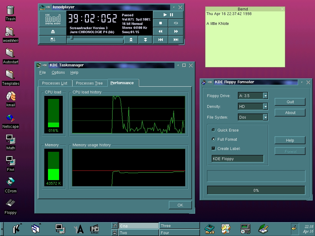
The KDE 1 task manager looks _very_ similar to the Windows NT 4 task manager (from the mid nineties): https://guidebookgallery.org/screenshots/winnt40 (scroll down to 'task manager' and click the faint tab control marked '3' in the upper left of the specific screen shot)
Until Win10, the NT OSes had that same basic task manager with the cool looking green graphs. WinNT 3.51 had a much more crude looking task manager
Thanks for the info and the tips on how to view the screenshot of the “Performance” tab. I would have been using Windows 95 or 98 back then but I don’t remember it displaying resource usage like that. I started using Red Hat Linux 6 in 1999/2000 so wouldn’t be very familiar with Windows 2000 or XP.
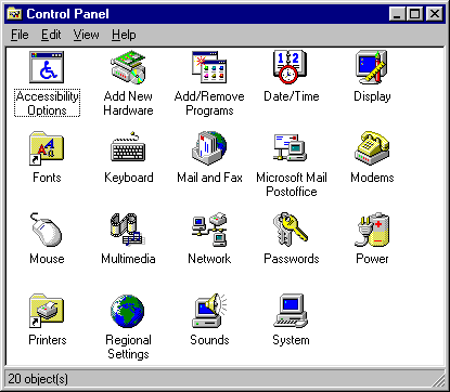
The Windows 95 icons were so good. I'm comparing those to what I see in Windows 10 and it's kind of funny. Examples I think are much worse: Keyboard, Mouse, Accessibility Options/Ease Of Access, Network, Passwords/Credential Manager. What happened?
> I'd love to see GEM, Canon Cat, NeXTSTEP, and BeOS here
That would be good. I'd also like to see something that's at a much lower level, basically an catalog of specific ways of accomplishing specific basic tasks in a particular UI, current or historical. I've switched between different OSes, and each time I sorely miss some very particular thing (e.g. Windows' very useful line-based Home/End key behavior vs. Mac OS's totally pointless document-based behavior). I'm sure even dead-end OS's had very good ideas like these that have been subsequently lost.
My weird dream is that some day someone could use a catalog like that to combine all the best ideas into something that's as close to perfect as possible.
I generally avoid slipping in overt promotion of my book [1], but this cries out for it. Find out how it really went down, what the debates were like, and what it was like to be there.
This is a quickie, copy-and-paste job from publicly available sources. Mostly accurate, except for calling the Alto keyset "the Alto keyboard." As some of the comments point out, it's quite incomplete.
My user experience on this site: scroll to cool picture, click cool picture, click back button expecting to go back to text. Back button takes me back to hacker news, urgh. Click link to site again, scroll to where I was. Click next cool picture and forget that back is broken. Click back. Urgh! Actually I've tried to use the back button four times now and I guess it's best if I just don't finish reading the site.
My first reaction is that it is disappointing that GUIs haven't changed all that much from Xerox.
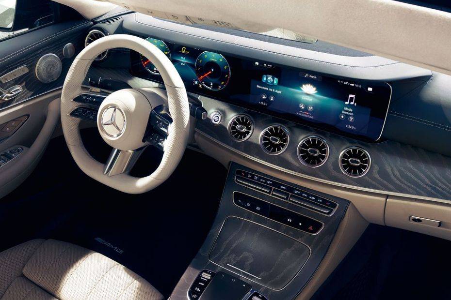
However, on second thought, how different is the user interface on a car from the 30s from a modern car? So maybe it isn't surprising that the GUI hasn't radically changed
> how different is the user interface on a car from the 30s from a modern car
A lot I would say, even on a much smaller time scale.
The features are completely different besides the very basic odometers which anyway look very different and present much different information. A modern car not only has much more features, but even the way of consuming the old ones is radically different, and not just because of the switch from analog to digital, e.g. steering wheels have seen a massive amount of analog buttons and levers.
There's only so much efficiency and clarity that can be squeezed out of a GUI.
Familiarity and consistency are themselves powerful elements of UI/UX.
Upshot: stop fucking with the interface.
Apple, renowned for design, has essentially only ever offered two GUIs, "Classic Mac" (1984--1999) and "Aqua" (1999--2022) Note that the second has been in use longer than Classic, by over 60% (23/16 ~= 1.64).
Good UIs don't change.
Apple have tweaked at the edges, changed some of the styling and colours, and added features (e.g., workspaces / virtual desktops). But a user of the Classic Mac could sit down at a modern OSX system and figure it put pretty quickly.
(I'm actually not a fan of the interface, though I generally use one based on a precursor / ancestor of it, WindowMaker, based on NeXTStep from the NeXT Machine.)
Browsing 1992 through 1995 gave me tears. Btw, where is Vista, ME, or Windows 98, or 7 for that matter? Vista had an especially unique UI with Aero and Windows 7 was an adaptation of that I believe.
Non-inclusion of Vista is really strange given how influential it was.
I used to be among those Linux users that wanted to make the GUI look cool™. I spent a LOT of time browsing gnome-look.org and at the height of Vista popularity, the Aero knockoffs were everywhere.
I concur about Windows Vista. For all the criticism that OS received, it did bring Windows a compositing desktop similar to Mac OS X, which was a crucial milestone to the GUI experience, which brought compositing desktops to more than 90% of personal computer users.
I believe Windows 98 and ME were omitted because this is largely a presentation of the evolution of GUIs. Windows 98 and ME did not substantially differ from Windows 95 in terms of their look-and-feel; the same can be said about Windows NT 4 and Windows 2000.
> Windows 98 and ME did not substantially differ from Windows 95 in terms of their look-and-feel; the same can be said about Windows NT 4 and Windows 2000.
The only differences I remember are quick start icons in the taskbar, and gradients in window title bars.
Snow Leopard (OS X 10.6) really needs a representation of the brushed metal appearance in the image gallery. (There had been two presentation styles, the general one seen in the images, and a brushed metal one for utilities.)
Hi author! Cool site. It was odd getting a "hi hacker news would you like to subscribe to my UI mailing list", but OK. But it was really not great seeing this [0] when I clicked "no", given the whole thing is about UI.
meh. dude forgot Engelbart's augment project (from the mother of all demos). the unix shell (which is the exemplar of a class of UIs) and Raskin's Canon Cat keyboard based interface. Or PLATO, which was doing remote graphical rendering before Y or X.
I liked seeing the hardware in the first two pictures. It gave an idea of what it was like interacting with the computer. Do you think you could add this for some of the other interfaces, even multiple form factors if they existed for the operating system?
The title promises more than is delivered: computer user interfaces existed before the GUI, and interfaces to physical machines in general have existed for centuries, and a lot of those antecedents have influenced present-day computer interfaces.
I strongly disagree. Content fades in moments after scrolling, and there's no content at all if JavaScript is disabled. The author clearly values style over usability.
Agreed. If anybody knows such a site, I'd like to see it.
I just recently collected old screenshots of Facebook, Twitter, and other popular sites from 2010 and before. Looking back, all of them have a certain charm I would like to bring back in future personal projects.
.jpg#mw-jump-to-license)
Some feedback:
1. All interfaces presented were graphical user interfaces for desktop personal computers. However, there's a wide world of user interfaces for computers beyond conventional point-and-click GUIs. A command line interface, for example, is still a user interface, and in fact there has been much diversity of command line interfaces besides Unix and MS-DOS. For example, I remember reading in The Unix Haters Handbook critiques of the Unix shell, comparing it to the CLIs of other operating systems such as VMS. It would have been cool to have learned about the history of various CLIs and how they evolved. Regarding other user interfaces, there are touchscreens and voice, and even among GUIs there have been models that were not heavily influenced by the Apple Macintosh and Microsoft Windows, such as Symbolics Genera, Project Oberon, and Plan 9's 8 1/2 and rio GUIs.
2. Some highly influential GUIs are missing. For example, as influential Windows 95's UI was, its look and feel clearly shows influences from NeXTSTEP, the first GUI to introduce the gray, 3D, beveled look that Windows 95 embraced.